
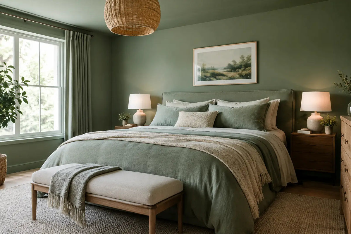
Bedroom colour drenching is particularly compelling in a room designed for rest. Rather than treating walls, skirting boards, doors and ceiling as separate visual elements, it allows one carefully chosen shade to envelop the space. The result can feel wonderfully calm, tailored and cocooning - the sort of bedroom that encourages you to switch off at the end of a demanding day.
For a considered bedroom, this is not simply a case of applying the same pot of paint everywhere. The success lies in the relationship between the colour, natural light, upholstered furniture, bedding and the proportions of the room. Done well, colour drenching gives even a practical bedroom a more architectural, quietly opulent presence.
What is bedroom colour drenching?
Colour drenching means using a single colour, or a very closely related family of tones, across the principal surfaces of a room. Walls, ceiling, coving, skirting boards, radiators, door frames and doors are often painted in the same shade. In some schemes, cabinetry and fitted wardrobes follow suit.
The approach removes the hard visual breaks created by bright white woodwork and ceilings. Your eye moves around the room more gently, which can make a bedroom feel restful and purposeful. It also lets tactile pieces take centre stage: a channel-tufted headboard, a deep-pile carpet, linen bedding or a beautifully upholstered ottoman bed gain greater impact against a unified backdrop.
There is no rule that says every surface must match exactly. A softened variation can be more flattering in certain homes. For example, you may choose the same paint colour in a matt finish for walls and a durable eggshell on woodwork, or select a ceiling shade that is a fraction lighter. The effect remains immersive without appearing overly rigid.
Why colour drenching works so well in bedrooms
Bedrooms contain more functional elements than we first realise: wardrobes, switches, curtains, radiator covers, doorways and often storage furniture. Contrasting finishes can make these components feel fragmented. A drenched scheme gently recedes around them, creating a more composed setting for the bed - rightly the hero of the room.
It also offers a useful response to awkward proportions. In a smaller bedroom, painting the ceiling and joinery in the wall colour can blur the edges and prevent the ceiling from feeling visually separate. The room may feel less chopped up, even if the shade itself is deep. In a large room, a richer drenching colour can bring welcome intimacy, especially where high ceilings might otherwise feel cool or impersonal.
Above all, it can support the emotional purpose of a bedroom. Soft greens, muted blues, warm mushroom tones and dusty rose-based neutrals have a natural affinity with rest. Darker shades, such as tobacco, olive, ink or aubergine, can create the hushed character of a fine hotel suite when balanced with generous texture and considered lighting.
Choosing the right colour for your room
Start with daylight rather than a trend forecast. A north-facing bedroom often receives cooler, gentler light, so an icy grey or blue may feel more severe than it does in a south-facing room. Warmer neutrals, olive greens and complex clay tones can lend this orientation more comfort. In a bright south-facing bedroom, muted blue-greens, chalky stone shades and deeper earthy colours tend to retain their character rather than looking washed out.
The size of the room matters, but not in the simplistic sense that small rooms require pale paint. A small bedroom can be exceptional in a deep, enveloping shade. The trade-off is that it will feel intimate rather than airy. If that sense of retreat appeals, embrace it. If you want to preserve a lighter feel, choose a mid-tone with warmth and use lamps, mirrors and reflective textiles to maintain softness after dusk.
Before committing, view large samples on more than one wall and at different times of day. A colour beside the window may look entirely different from the same colour behind the bed. Consider it alongside upholstery and bedding, too. A fabric swatch is invaluable here: its pile, weave and undertone can change the whole impression of a painted room.
Begin with the bed, not the paint chart
For many bedrooms, the most expensive and visually commanding decision is the bed. It is sensible to choose its fabric and headboard profile first, then build the drenching palette around it. A tall winged headboard in warm taupe velvet, for instance, sits beautifully within a tonal mushroom or putty scheme. A bouclé bed in ivory benefits from a backdrop with enough depth to define its silhouette, such as sage, mineral grey or muted terracotta.
A fully upholstered bed introduces softness on a scale that painted surfaces cannot. When the wall, ceiling and joinery are unified, the contrast between smooth paint and tactile upholstery becomes particularly luxurious. This is where materials do the work of decoration, rather than relying on a collection of competing accessories.
Bringing texture into a drenched scheme
The risk with any tonal interior is not darkness but flatness. Texture is what keeps a single-colour room inviting. Combine a matt painted finish with an upholstered headboard, wool or cotton throws, linen curtains, a woven rug and bedding with a subtle sateen or washed finish. These shifts in surface catch the light differently, adding depth without disrupting the calm.
Wood also brings welcome warmth. Walnut bedside tables or oak flooring can sit comfortably within a drenched palette, particularly where the paint has an earthy undertone. If you prefer a more contemporary finish, lacquered furniture, smoked glass and antique brass lighting can add a restrained sheen.
Avoid trying to match everything precisely. A bedroom in olive does not need olive cushions, olive curtains and olive carpet. That can feel overly coordinated. Instead, work within a narrow tonal range: moss, stone, tobacco, flax and aged brass may all belong in the same room while giving it more life and sophistication.
Light the room as carefully as you paint it
Colour drenching changes dramatically after sunset, which is precisely when a bedroom should feel at its best. Overhead lighting alone is rarely flattering. Layer bedside lamps with a warm bulb, a dimmable central fitting and, if appropriate, discreet wall lights near a dressing area or reading chair.
Aim for warm white light rather than a stark, cool tone. Deep paint absorbs light, so darker bedrooms generally need more considered placement rather than brighter, harsher bulbs. A pair of bedside lamps that cast light across the headboard will make an upholstered bed feel especially inviting while giving enough illumination for reading.
Curtains deserve equal attention. Full-length, lined curtains bring softness to a drenched room and help control the first morning light. If sleep quality is a priority, blackout lining can be a worthwhile choice, particularly on bright streets or during summer mornings. The fabric need not be identical to the walls; a closely related neutral, a subtle stripe or a quiet woven texture will usually feel more refined.
Details that make the scheme feel bespoke
The most successful bedroom colour drenching has a sense of intention in the small details. Paint radiators and pipework where practical, choose socket plates that do not interrupt the wall colour unnecessarily, and consider whether freestanding wardrobes should blend in or provide a deliberate contrast. If storage is limited, an ottoman bed is a discreet way to preserve the clean, restful appearance of the room without sacrificing the practicality a household needs.
Artwork should be chosen for mood, not merely to fill wall space. A single large tonal piece above a low chest, or a softly framed print leaning on a shelf, can be more effective than a busy gallery wall. Mirrors are useful in darker schemes, but position them to reflect a pleasing view, lamplight or daylight rather than visual clutter.
For made-to-order bedrooms, fabric selection offers another opportunity to make the room personal. Hyder Living’s complimentary fabric swatches allow you to assess an upholstery colour against paint, flooring and curtains in your own home, where it matters most. The right combination should look composed in daylight and feel comforting under lamplight.
A drenched bedroom does not have to be dramatic to feel luxurious. Sometimes the finest result is a quiet shade, a beautifully proportioned bed, crisp sheets and lighting that makes the room feel like it belongs entirely to you. Choose the colour that lets your shoulders drop when you step through the door - that is the one worth living with.
Share:
Boutique Hotel Bedrooms: Details Guests Feel
Contract Mattresses That Guests Remember