
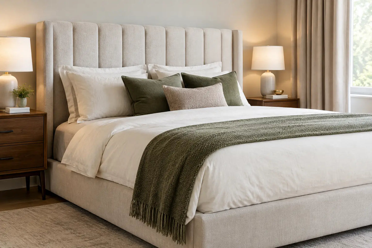
A beautifully upholstered bed can change the entire atmosphere of a room, but choosing bedroom upholstery colours is rarely as simple as picking a shade you like on a screen. The fabric will sit beside your flooring, curtains, artwork and lighting every day. It should feel considered in morning light, flattering by lamplight and quietly restorative when the room is ready for sleep.
For a made-to-order bed, colour is not a finishing touch. It is part of the design decision, alongside the silhouette of the headboard, the scale of the bed and the storage you need beneath it. The most successful choices balance personal taste with the character of the room, creating a scheme that will still feel luxurious years from now.
Start with the mood you want to come home to
Bedrooms benefit from colours that lower the visual temperature of the room. This does not mean every bed needs to be pale grey or cream, although both remain elegant choices. It means considering whether you want the space to feel airy, cocooning, dramatic or softly tailored.
Warm neutrals such as oatmeal, putty, stone and mushroom bring an easy, hotel-like calm. They work especially well with natural oak, warm white walls, brass accents and layered bedding in ivory or taupe. A neutral upholstered bed also gives you freedom to change cushions, throws and occasional furniture as your taste evolves.
For a more enveloping finish, consider deeper tones. Ink blue, forest green, rich charcoal and espresso brown can make a generous headboard feel wonderfully architectural, particularly in a large bedroom with good natural light. These shades are sophisticated rather than showy, and they offer a handsome backdrop for crisp white bed linen, textured wool throws and antique brass or dark timber furniture.
Soft, muted colour has its own appeal. Dusty rose, muted sage, mineral blue and gentle terracotta introduce personality without making the bedroom feel busy. The key word is muted. Greyed or earthy versions of a colour tend to be easier to live with than highly saturated shades, especially when used across a substantial upholstered bed.
Bedroom upholstery colours need to work with the light
A fabric swatch viewed in a bright showroom or on a phone can look quite different once it reaches your bedroom. North-facing rooms often have cooler daylight, which can make grey fabrics appear blue and pale creams look slightly flat. In these spaces, warmer neutrals, soft camel, biscuit and olive-based greens can bring welcome balance.
South-facing bedrooms receive stronger, warmer light and can usually accommodate cooler tones with ease. A dove grey, blue-grey or silvery taupe may look particularly refined here. However, very pale fabrics can appear almost washed out at noon, so texture becomes essential. Bouclé, velvet, woven chenille and linen-look fabrics add depth even when the colour itself is understated.
Do not judge a swatch at one moment of the day. Place it vertically against the wall near where the headboard will sit, then look at it in daylight and with your bedside lamps on. This small step often reveals the true undertone. A beige that looked neutral may prove distinctly yellow, while a grey may carry a violet or green cast that changes how it sits alongside your carpet and paintwork.
Consider scale before committing to a statement shade
The larger the bed and headboard, the more visual weight its upholstery carries. A super king bed with a tall winged or wall-panel headboard can become the defining feature of the room, so a bold colour will be read as a deliberate interior decision. That can be magnificent, but it deserves restraint elsewhere.
If you are drawn to a deep teal, wine, navy or black upholstered bed, allow it space to breathe. Keep walls quieter, choose bedding with tonal variation rather than competing prints, and repeat one small note of the bed’s colour in a cushion, artwork or lampshade. This creates a composed room rather than a collection of separate choices.
In a compact bedroom, a lighter or mid-tone fabric can help preserve a sense of openness. That said, dark upholstery is not forbidden in a smaller space. A charcoal or navy divan with a low, streamlined headboard can look exceptionally smart, particularly when paired with pale walls and a light rug. Proportion matters more than a rigid rule: a high, heavily buttoned headboard in a very dark shade will naturally feel more substantial than a simple panelled design in the same fabric.
Choose fabric and colour as one decision
The same shade can feel entirely different depending on the upholstery fabric. This is one reason colour names alone are not enough when choosing a bed.
Velvet deepens colour and catches the light, giving navy, emerald, plum and soft blush a particularly luxurious character. It is ideal for a bedroom that calls for glamour and softness, although the pile can show pressure marks or subtle shading in certain lights. This is a natural feature of velvet rather than a fault, and it adds to its tactile appeal.
Woven fabrics, including chenille and textured plain weaves, tend to present colour more evenly. They are excellent for warm neutrals, soft greys and earthy shades, and they suit both contemporary and more traditional bedrooms. A woven stone or taupe bed offers a calm, tailored appearance that works across changing décor schemes.
Bouclé and nubby textures bring visual softness, particularly in cream, ivory, biscuit and pale mushroom. They are beautiful in bedrooms designed around layered texture, but their raised surface means they are best chosen with realistic expectations about household life. If you have young children, pets that jump onto the bed, or frequently enjoy breakfast in bed, a tighter weave in a forgiving mid-tone may be the more practical luxury.
Think about daily life, not just the finished photograph
The most impressive bedrooms are comfortable enough to use without anxiety. Very pale upholstery can be exquisite, yet it will ask for more care around fake tan, dark denim, cosmetics and pets. A mid-tone neutral such as pebble, taupe, mushroom or soft olive is often more forgiving while retaining the same elevated look.
Dark fabrics conceal some marks but can show lint, pet hair and dust, especially velvet and near-black shades. If your bedroom receives direct sunlight, be mindful that intensely coloured fabrics may gradually fade over time. Curtains, blinds and considered bed positioning all help protect your investment.
For storage beds and ottoman bases, colour also influences how substantial the bed appears. A lighter fabric can make a large ottoman base feel less dominant, while a darker shade can emphasise its tailored, grounding presence. If your room needs additional storage but you want a light, serene scheme, an upholstered ottoman in oatmeal or soft grey can deliver both practicality and a calm visual finish.
Build a considered palette around your headboard
Your headboard does not need to match every element in the room. In fact, exact matching can look overly coordinated. Aim instead for connection through undertone, material and contrast.
A warm beige upholstered headboard might sit beautifully with off-white walls, oak bedside tables, antique brass lighting and bedding in flax, ivory and chocolate. A blue-grey headboard could be paired with soft white walls, walnut furniture and bedding in cloud grey, navy and crisp white. With a green bed, consider natural timber, aged bronze and muted floral or botanical artwork rather than introducing more bright green elsewhere.
If you love pattern, let the upholstered bed provide the visual anchor. A plain fabric offers the flexibility to bring in patterned curtains, wallpaper or cushions. Conversely, if the room has a dramatic wallcovering or striking artwork, a quieter bed fabric will often produce the more expensive-looking result.
Why fabric swatches are worth the wait
A swatch is a design tool, not a formality. It allows you to see the true colour, weave, pile and quality of the upholstery before placing an order. Compare it with paint samples, flooring and existing furniture, then view it under both natural and artificial light. If two shades seem close, the swatch will show whether one is warmer, cooler, cleaner or more textured.
At Hyder Living, made-to-order upholstery gives you the opportunity to create a bed around your room rather than force your room around an off-the-shelf bed. Take time with the fabric selection, particularly for a statement headboard or an emperor-size bed. A well-chosen colour will make the entire bedroom feel more coherent from the moment you enter.
The finest choice is usually the one that continues to please after the excitement of redecorating has passed. Choose a fabric you want to touch, a shade that flatters your light and a bed design that supports the way you rest. That is how a bedroom becomes not merely well furnished, but deeply personal and genuinely restful.
Share:
How to Prepare Your Bedroom for Bed Delivery
Open Coil Versus Pocket Springs: Which Feels Better?